The Gears of War: E-Day logo does something the series hasn't needed to do in nearly two decades: introduce the franchise brand to a story that starts everything over. This page breaks down how the logo and key art are built, where the official versions live, and what fan projects should keep in mind when using them.
Table of Contents
How the E-Day logo is designed
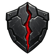
The logo stacks two elements. The series name - "GEARS OF WAR" - sits in its established clean lettering, and beneath it the subtitle "E-DAY" is set in heavy, distressed red capitals, as if stamped onto rusted armor. The palette follows the game's red-and-black identity: deep gunmetal backgrounds, crimson highlights, and just enough white for the series name to read at thumbnail size.
In the "Emergence Begins" variant, the E-Day wordmark sits under a Locust skull bursting through cracked ground, ringed in the same crimson glow. This is the image Microsoft has leaned on for the launch campaign, and it is the version most recognizable in thumbnails and store tiles.
| Element | Description |
|---|---|
| Series name | "GEARS OF WAR" in clean white capitals |
| Subtitle | "E-DAY" in distressed crimson lettering |
| Palette | Gunmetal black, blood red, off-white accents |
| Launch variant | Locust skull emerging through cracked ground, "Emergence Begins" tagline |
| Key art | Marcus and Dom back to back beneath Locust arms |
Where the key art appears
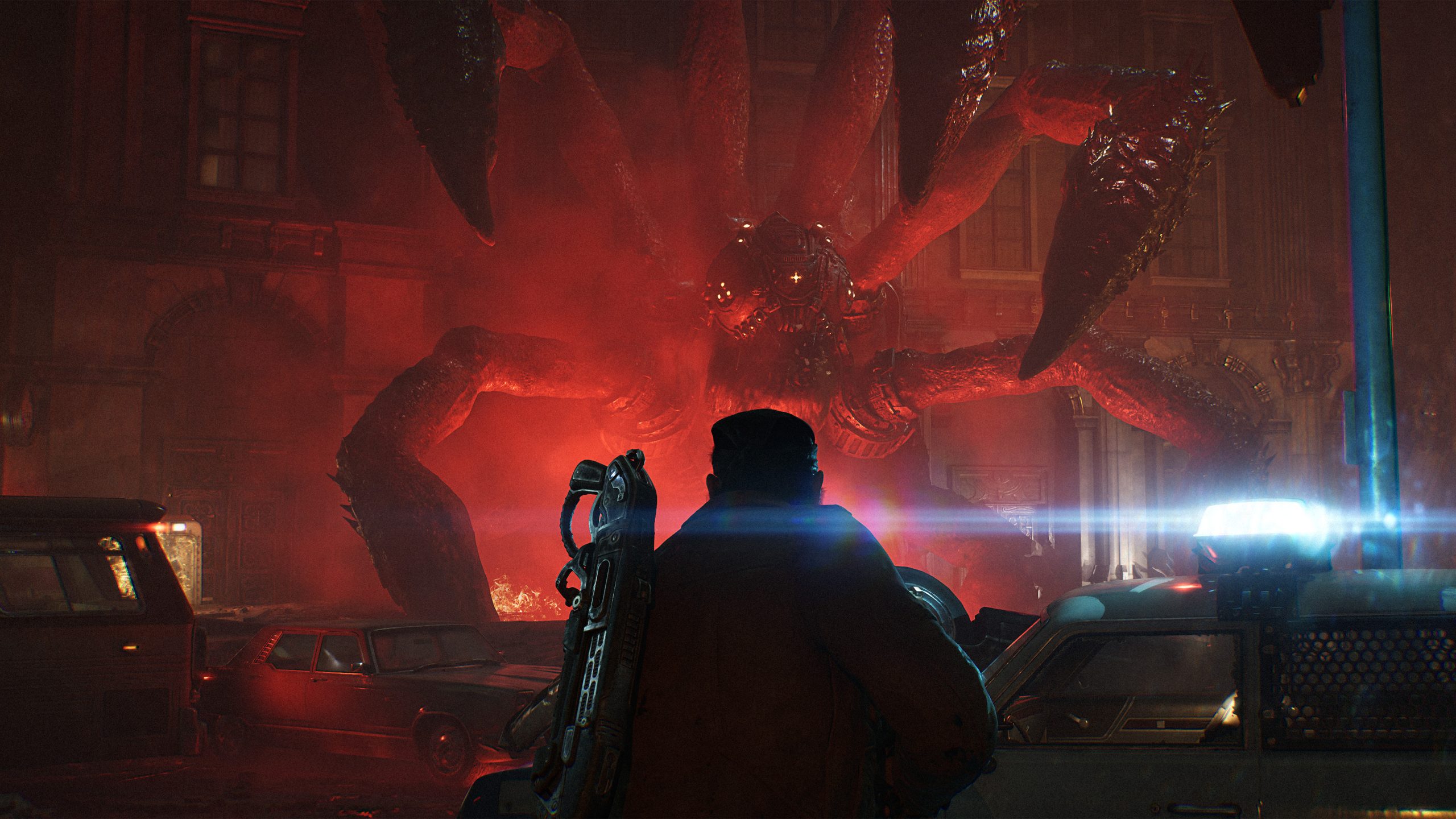
The official key art is the backbone of the game's store presence. On the Xbox store page, the hero image shows Marcus Fenix and Dominic Santiago standing back to back under the reaching claws of Locust creatures - the same image used across the Steam listing. The crimson skull variant anchors the October 1 early-access launch announcement.
For players building wallpaper collections or channel art, the safest sources are the official ones: press assets on gearsofwar.com, the store pages above, and the official Gears of War YouTube channel trailer thumbnails.
Tip
Crediting fan work If you run a fan site or channel, caption official artwork with its source ("Image: Xbox Game Studios / The Coalition") rather than re-uploading crops without credit. It keeps your project clearly on the fan side of the line.
Using the emblem in fan projects
The cog-and-skull Gears emblem and the E-Day wordmark are trademarks of Microsoft and The Coalition. Fan guides, podcasts, and community hubs use them all the time - the established practice is reference, not replacement:
- Do not build your site or channel logo out of the official emblem; create something original that nods to the aesthetic instead.
- Do not imply official affiliation. A visible "unofficial fan project" note keeps expectations clear.
- Do not sell merchandise carrying the emblem or wordmark - that crosses from reference into infringement territory.
Fan sites that want an original mark typically draw their own shield, gear, or crack motif in a similar palette, keeping the crimson-and-gunmetal mood without copying the protected artwork.
The logo in the game's identity
Everything the logo promises - the dark red glow, the decayed metal, the sense of something pushing up from underneath - carries into the game itself. Kalona's streets burn in the same palette, the Omen damage indicator glows the same crimson, and the title screen sits on the same rusted textures. It is one of the more cohesive brand-to-game translations in the series, and it starts with a wordmark that looks like it survived Emergence Day.
References
- Gears of War: E-Day
- Pre-purchase Gears of War: E-Day on Steam
- Xbox EXPOSES Gears of War E Day Exclusivity Timeline After PS5 Logo Controversy
- Gears of War: E-Day Devs SCARED Xbox Will FIRE Them | $400 Million Dollar GAMBLE